I saw some demonstrations of dynamic plots with the animation package in R. So I was looking for a small example where I could try this out myself. So here we go.
In http://yetanothermathprogrammingconsultant.blogspot.com/2015/09/linearizations.html an example of a 2-objective land allocation problem is discussed. There are two competing objectives:
- Minimize Cost: assign plots such that total development cost is minimal.
- Maximize Compactness: cluster plots with the same land-use category together.
A pure cost based solution can look like the left picture below. When we take into account the compactness objective we could see something like the right picture.
 |  |
| Minimize Cost only | Minimize cost-α*compactness |
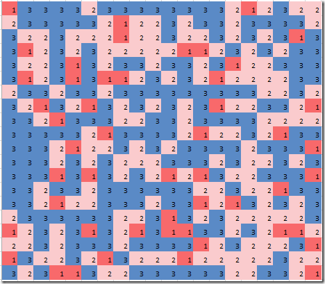
These “plots” were just colored cells in an Excel spreadsheet. Now a more interesting and dynamic plot can be made if we play with the trade-off α between cost and compactness. That is done in the plot below. This was done using R and the packages ggplot2 and animation.

The bottom figure shows the efficient frontier. The curve indicates (cost,compactness) combinations that are Pareto optimal. This plot is in the f-space (the space of the objective functions). The top plot shows for different points along the efficient curve how the actual land assignment looks like. I.e. this plot is in the x-space: the space of the original decision variables.
Notes
- If you pay careful attention you will notice that the dynamic plot and the static excel graphs have the y-axis reversed. In Excel row 1 starts at the top, while in R plots row 1 is at the bottom.
- It may be a good idea to apply some compactness constraints on political districts (in the US). This would reduce some of the crazy maps that are the result of gerrymandering. Compactness still can lead to unfair results, see: https://www.washingtonpost.com/news/wonk/wp/2015/03/01/this-is-the-best-explanation-of-gerrymandering-you-will-ever-see/.
- The above dynamic gif was the result of solving 50 MIP models.
- When generating HTML instead if a dynamic GIF VCR-style control buttons are added:

R Code
# # read results from GAMS model # setwd("c:/tmp/") library("RSQLite") sqlite <-dbDriver("SQLite") con <- dbConnect(sqlite, dbname="results.db") objs <- dbGetQuery(con,"select * from objs where objs in ('cost','compactness')") plotdata <- dbGetQuery(con,'select * from plotdata' ) dbDisconnect(con) library(ggplot2) library(gridExtra) library(animation) # # pivot df from long format to columns 'cost','compactness','a' # objs2 <- data.frame(cost=objs[objs$objs=="cost","value"], compactness=objs[objs$objs=="compactness","value"], id=objs[objs$objs=="cost","a"]) # needed to draw red lines indicating the current point on the curve mincost <- min(objs2$cost) maxcost <- max(objs2$cost) mincomp <- min(objs2$compactness) maxcomp <- max(objs2$compactness) N <- nrow(objs2) # # simple line plot of cost vs compactness # add lines to indicate where we are on the curve # plot2 <- function(currentCost,currentCompactness) { ggplot(data=objs2,aes(y=cost,x=compactness))+ geom_line(color="blue")+ annotate("segment", x = mincomp, xend = maxcomp, y = currentCost, yend = currentCost, color = "red")+ annotate("segment", x = currentCompactness, xend = currentCompactness, y = mincost, yend = maxcost, color = "red") } # # heatmap plot # plot1 <- function(pltdata) { pltdata$x <- as.integer(substr(pltdata$j,4,stop=100)) pltdata$y <- as.integer(substr(pltdata$i,4,stop=100)) pltdata$value <- as.factor(pltdata$value) ggplot(pltdata, aes(x=x, y=y, fill=value))+ geom_tile(color="black", size=0.1)+coord_equal()+ scale_fill_brewer(palette="Spectral",name="Land-use type")+ theme_classic()+ theme(axis.title.x=element_blank(), axis.text.x=element_blank(), axis.ticks.x=element_blank())+ theme(axis.title.y=element_blank(), axis.text.y=element_blank(), axis.ticks.y=element_blank())+ ggtitle("Land-use Optimization Results") } # # combine both plots # plot<-function(id) { pdata <- subset(plotdata,a==id) p1 <- plot1(pdata) cost <- objs2[objs2$id==id,"cost"] compactness <- objs2[objs2$id==id,"compactness"] p2 <- plot2(cost,compactness) grid.arrange(p1,p2,ncol=1,heights=c(1,0.5)) } # # animation # saveGIF({ for (i in 1:N) { # ids are of the form a1,a2,... id <- paste("a",i,sep="") print(plot(id)) if (i==1) { # add some pause print(plot(id)) print(plot(id)) } } },interval = 0.3, movie.name = "landuse.gif", ani.width = 600, ani.height = 800) |
No comments:
Post a Comment