In this model, the main variable is x which is a binary variable indicating if a person is assigned to a facility at time t. The GAMS listing file is not a very convenient way to look at this:
---- VAR x assign provider to facility
LOWER LEVEL UPPER MARGINAL
5 .7
.Hospitalist .04/01/2019 . . 1.0000 3.0000
5 .7
.Hospitalist
.04/02/2019 . . 1.0000 3.0000
5 .7
.Hospitalist
.04/03/2019 . . 1.0000 3.0000
5 .7
.Hospitalist
.04/04/2019 . . 1.0000 9.0000
5 .7
.Hospitalist
.04/05/2019 . . 1.0000 9.0000
5 .7
.Hospitalist
.04/06/2019 . . 1.0000 9.0000
5 .7
.Hospitalist
.04/07/2019 . . 1.0000 9.0000
5 .7
.Hospitalist .04/08/2019 . . 1.0000 9.0000
5 .7
.Hospitalist
.04/09/2019 . . 1.0000 9.0000
5 .7
.Hospitalist
.04/10/2019 . . 1.0000 9.0000
5 .7
.Hospitalist
.04/11/2019 . . 1.0000 3.0000
5 .7
.Hospitalist
.04/12/2019 . . 1.0000 3.0000
|
I just showed a few records: there are more than 40,000 of them. Obviously, this is fairly useless for our application.
The GDX data viewer is showing by default:
 |
| Default view |
 |
| Pivot table |
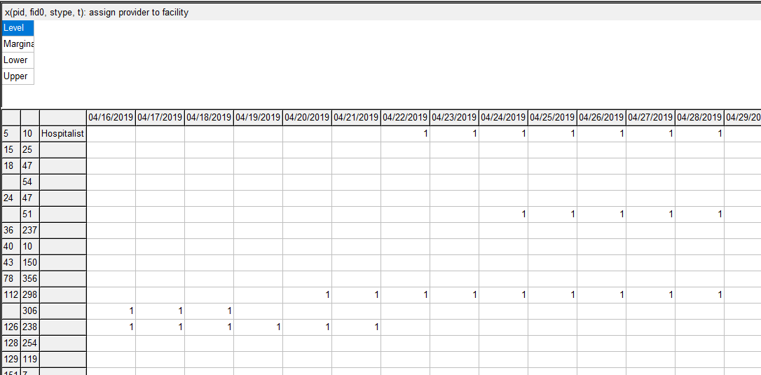
To be able get a more compact and meaningful visualization of the results we need to post-process the results. E.g. we prefer names instead of id's. Here I show a visualization in Excel, where we can create different views (using the auto-filter facility in Excel). Note: I have anonymized the names in this demo (in the real application we have real names to add immediate context).
 |
| Excel based visualization |
Not only is this effort useful for viewing and understanding the results (important for debugging and improving the optimization model), but it also allows me to communicate results with the client. Although I ship results in the form of CSV files (to be consumed by a database tool), this CSV file is difficult to interpret directly. This Excel spreadsheet allows us to look at our large, complex solution in much more efficient and effective way. Of course, I have automated things, so after an optimization run, I can generate this spreadsheet using a script. Well, rather two scripts: one is written in GAMS and generates a large sparse data cube (with about 50k entries; later versions have about 100k entries), the second one is written in VBA and does the coloring among other things.
The advantage of using Excel instead of using a dedicated tool, is that it makes it easier to share results. In the business world, practically everyone is familiar with Excel. Emailing spreadsheets around is much more accepted than sending say executables.
Although creating this tool is not exactly cheap, being able to inspect results in a meaningful way and communicate about them is a big pay off. It is not unusual these tools develop into a more important decision support tool than just a debugging aid for an optimization model.
As an aside: developing this optimization model turned out to be an excellent tool to improve the underlying database. Optimization models look at all data in context, instead of just looking at it record by record. As we are solving large systems of simultaneous equations, we look at data as a whole: everything has to be up to snuff. This will put lots of emphasis on correct data, much more than traditional database applications. Data that initially looks quite decent, may actually contain more errors and inconsistencies than you would think. An optimization model, being very picky about the data, is a good tool to unearth these. So if you want to check your data: build some optimization models!
Developing a mathematical programming application is often much more than just doing mathematical programming.
I also find that early visualization feedback loops is key for a successful project in production. Often the pretty WebApp UI (like this one [1]) isn't ready yet and I also tend to go with Excel files often. Some tricks I use in those Excel files:
ReplyDelete- Create separate "view" sheets that show the same schedule from different angles. For example for Conference scheduling [2], I have a view sheet that shows the allocation per room over time, but also one that shows it per speaker over time and one per track theme over time.
- Uses colors to indicate either problems (red for hard constraints and orange for soft constraints) or show correlation between cells (like in [2] in the room over time view the cell background color is the track theme of that talk).
[1] https://www.youtube.com/watch?v=3CvadujUN1k
[2] https://youtu.be/ykF8DjxhQJI?t=351
Totally agree on the value of optimisation for finding errors in the data. Often we are also bringing together data that has been maintained in effectively separate silos by eg demand and supply sides of the business. Lots of times the data is internally inconsistent as well as incompatible with the data from the other sides of the business. Optimisation will often find gaps and loopholes that expose data errors
ReplyDelete